Essie Eats, named after the client, Esther, is a food blog based in the UK that needed design assets including a logo, business card and WordPress blog creation to advertise and recognized by various companies.
Logo Process
Final Logo
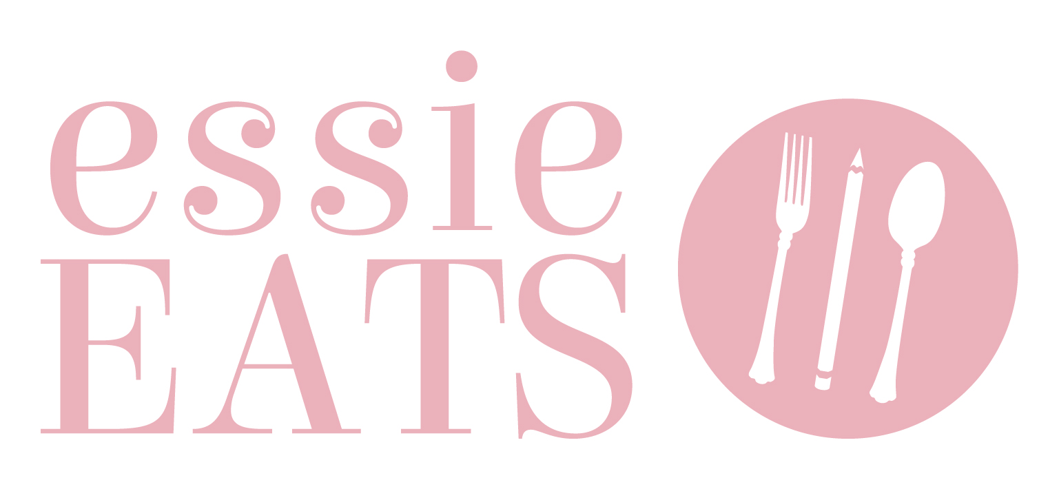
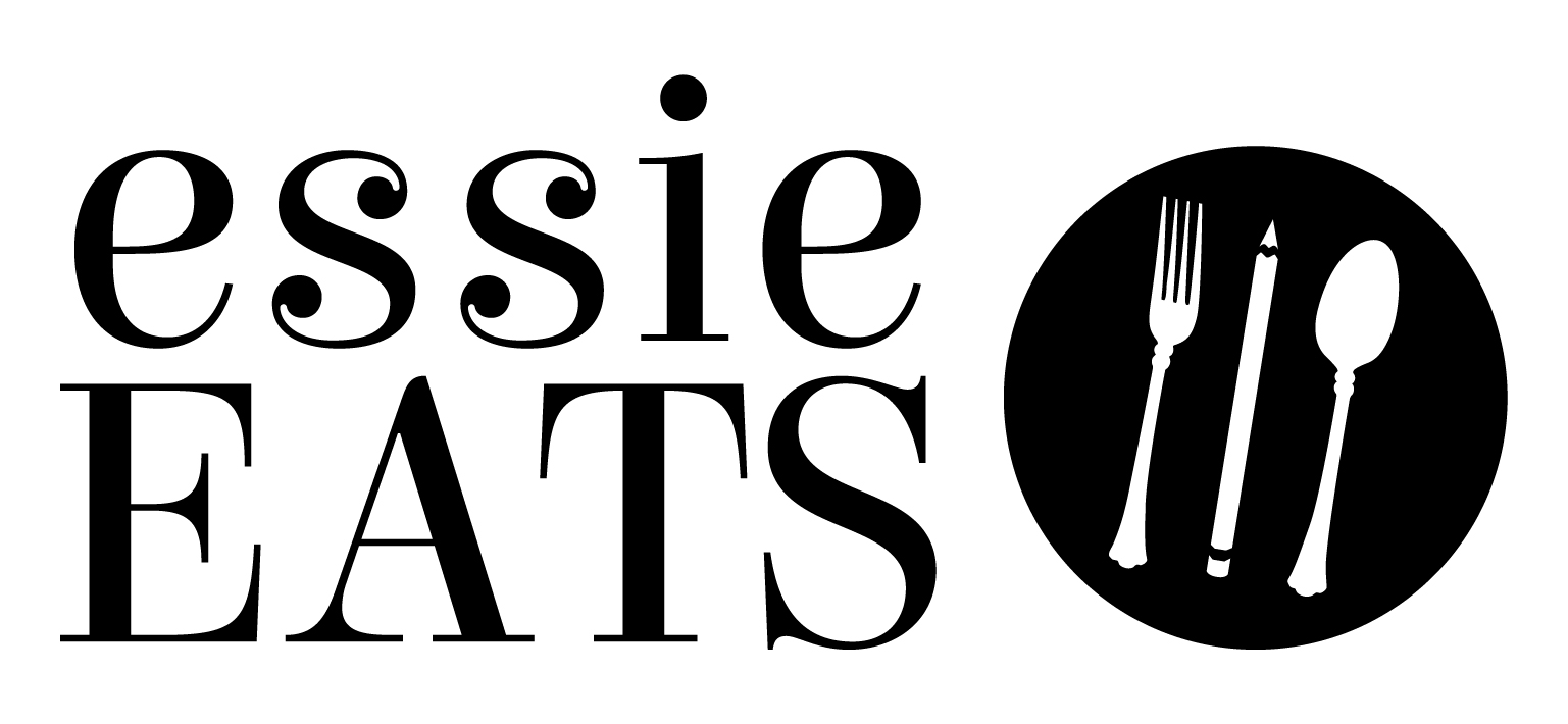
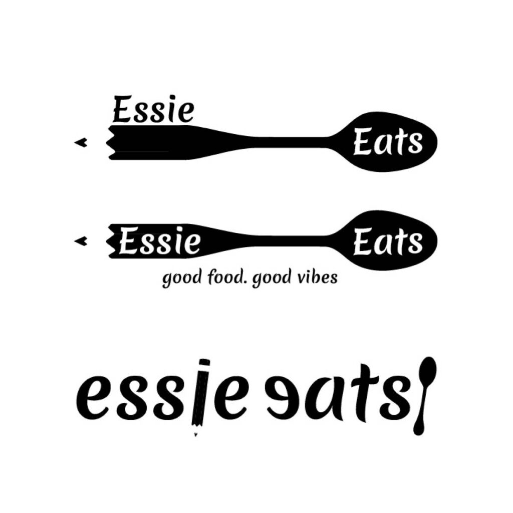
The client loved the playfulness of the typeface, Elsie, as well as the pencil that replaces a knife. Fun fact, the logo color reflects the client’s favourite lipstick, Mac Velvet Teddy Deep Tone Beige.
Logo Concepts
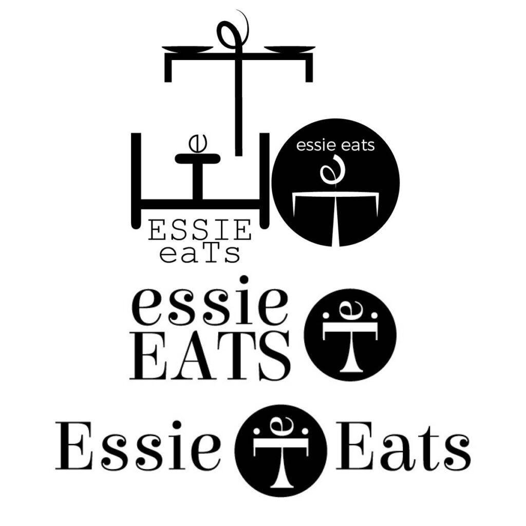
Icon Exploration
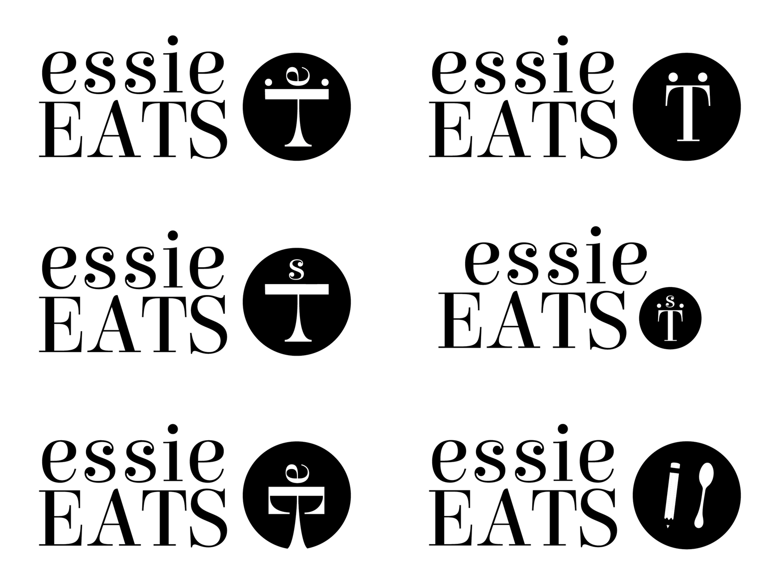
The client loved the font used in Concept 1 but wanted the pencil and spoon from Concept 2. From this exploration, the client selected the logo for her blog, which was then refined to the final logo.
Logo Application
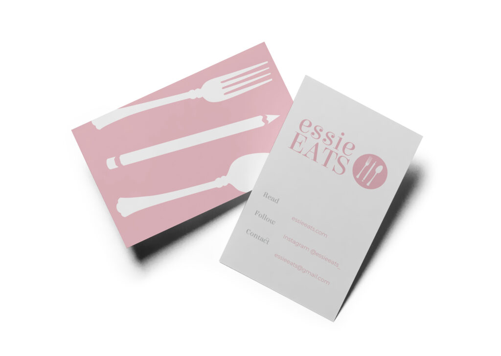
Business Card
Website
Instagram Post
Instagram Story Highlights
